

Web Design & UX Agency for B2B

A design system that earns trust.
Buyers decide where you sit in the market before sales ever speaks. If you want to be seen as enterprise, your site has to signal it. We build conversion-focused design systems for B2B SaaS that earn that trust.
Explore Partnership
See All Work
The Problem

Your site is the weakest part of your go-to-market.

01

The credibility gap

Paid spend and events are filling the funnel, but the site looks a generation behind the product. Competitors feel more credible at first glance, and the buying committee notices before you do.
02

The design bottleneck

Every design change waits on a developer, and no one can confidently state the current conversion rate. The site buyers judge you on stopped keeping pace with the company you're becoming.
03

The failed fix

A generalist redesign looked nicer for a quarter and demos didn't move. A design studio handed over gorgeous Figma files the build watered down. CRO tweaks can't rescue a site that loses trust in five seconds.
what we do

Positioned by design.

Most agencies start design with a mood board. Curio starts with your market. Before anything hits Figma, we build the strategic foundation that makes every design decision defensible against your buyers and your growth goals.

Research before design

Every engagement opens with ICP research and competitive analysis. We map how your buyers evaluate and what your competitors signal, so design decisions trace back to evidence instead of taste.

Brand craft meets conversion science

CRO shops make forgettable work. Design studios treat conversion as someone else's problem. We sit deliberately in the middle, holding every decision to three tests: where the eye goes, what the brand signals, and the story the page tells.

One team, no handoffs

Our designers and Webflow developers are one in-house team, so components are validated for the build while they're being designed. What gets approved in Figma is what ships. And feedback stays about business goals, never "do you like it."
Deliverables

What you have at the end of this engagement

A design system your team can actually use and extend, structured so AI tools can build with it too
UX research and conversion-focused wireframes that settle page structure and user journeys before visual design begins
Responsive page designs across desktop, tablet, and mobile. No "we'll figure out mobile later."
Motion and interaction direction that adds polish without dragging down page performance
Book Intro Call
Our Methodology

Growth Is a System, Not a Series of Projects

Design is where the system earns the right to convert. Buyers decide whether you’re credible before they read a sentence, and no amount of testing rescues a page that lost them in five seconds. We design to the evidence, then let the system prove it.

  1. 01

    Get Found

    Engines send buyers to pages, not homepages. We design the templates those buyers land on, so a citation from ChatGPT or an AI Overview arrives somewhere built to hold attention.

  2. 02

    Convert

    Credibility is the first conversion. ICP research and competitive analysis tell us what your market reads as enterprise, so every layout decision answers to where the eye goes and what the brand signals.

  3. 03

    Compound

    You get a component system, not a set of pages. New sections inherit the decisions already validated, so the site keeps its standard as your team extends it without us.
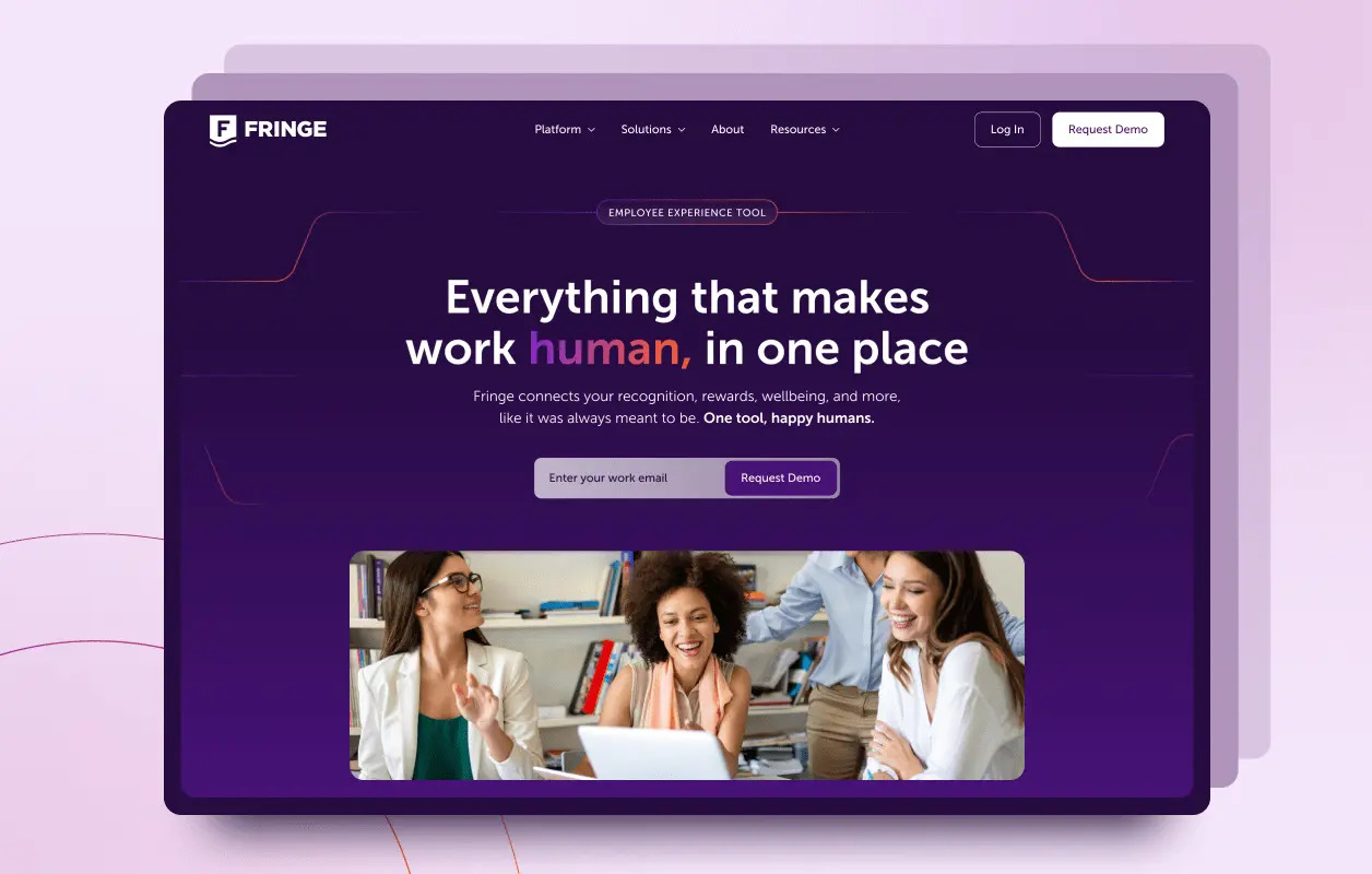
Work

Featured work

See all Work
See all Work

Questions?
We've got answers

Messaging, and specifically how it's structured. Direct headlines, subheads that carry the argument, and body copy written to your ICP's actual problems do more for conversion than any visual treatment. Design's job is positioning and giving the messaging visual aids. Good design lets you write shorter, because the layout draws attention where it belongs. A beautiful site that says nothing to no one still won't convert.
A full redesign is warranted when something changed drastically: the product shifted, you're repositioning, or you're entering a new market. That means a refreshed sitemap, redesigned brand, and new content. A refresh fits when the product and service are the same but you're not positioned well, the market moved, or you simply haven't touched the site in years. Same company, sharper presentation. If the site is fundamentally sound and conversion is the gap, conversion rate optimization is the cheaper first move.
The first question is always why. Has the product changed, the brand, the market? That answer decides whether you need a full redesign with a brand refresh, a phased update to the pages that drive conversion, or a complete teardown. From there, every engagement opens with ICP research and competitive analysis, so design decisions trace back to evidence instead of taste. Our designers and Webflow developers are one in-house team, so what gets approved in Figma is what ships.
Four things move the number most: how many unique page designs you need versus reusable templates, the complexity of each layout, how much research the project calls for, and whether a usable design system already exists. Add-ons carry their own weight, so motion and custom graphics get scoped separately rather than folded into a vague line item. We scope from the actual components of the build, which is why there are no surprise line items later.
Scope drives it more than page count. A phased update to your highest-intent pages moves fastest; a full redesign with new brand, new sitemap, and new content is the longest path. The sequence is consistent either way: research and competitive analysis, then UX and conversion-focused wireframes, then visual design, then build. Wireframes settle structure before visual design starts, which is what keeps the back half from sprawling.
Ask which failure you can least afford. Design studios often hand over gorgeous Figma files the build waters down, because nobody on the design side owns what actually ships. CRO shops optimize what's already there and make forgettable work. We sit deliberately in the middle: brand craft held to conversion science, with designers and Webflow developers on one in-house team, so what gets approved is what launches.
Usually the messaging, not the design. The most common failure is over-explaining: paragraphs generated fast, written to no one in particular, compensating with animation and graphics that don't mean anything. The second is a vanilla brand. Similar fonts, same animation style, same design patterns as every competitor, because the market research that tells you how to differentiate got skipped. Both are fixable without a rebuild. A brand that reads distinctly converts the right people with the right expectations.

Let's design the site your pipelines deserves.

Every engagement starts with a conversation. Book a call today and we'll walk through your site, your goals, and whether Curio is the right fit.


See How We'd Approach Your Site